Here is the new logo atop the scoreboard, courtesy of DirecTV DVR-

and here is the current Twins script logo-

A keen eye will notice that, though there are only two letters on the 'new' logo, both are different than that of the current logo. The 'S' is strikingly different and edgier, while the 'N' is similar to that of the Twins script that has been used since
Basically, what this means is that those hoping for a huge overhaul, or a return to the beautiful 2009 throwback jerseys as the new home jerseys, is that the decision on the Twins script for next season has already been made. While they will market this as a huge change, all it is is simply a font change. I can picture the words now- "We wanted to update the Twins brand to 2010." While the uniforms, pinstripes and all, may still be overhauled, it looks as though the Twins will be going with a familiar script logo next season.

11 comments:
I'm glad they are not making any big changes to the logo. To be honest I don't think they need to make any changes at all to the logo or the uniforms.
Just get rid of the pixie vests, that they never wear anyways and I say they are good to go.
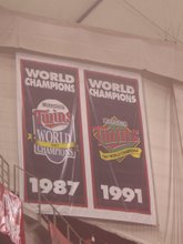
Isn't the current Twins script the same as what was introduced in 1987 (not '97)?
See http://johnstodderinexile.files.wordpress.com/2006/03/kirby%20puckett.jpg
Woops...definitely meant '87. They haven't touched it in 22 years.
Nightmares: Colored side panals, 3D numbers like Nationals or Texas, any amount of Black, useless piping, making the MPLS and St.P twins edgier, some sort of TC Bear logo, drop shadows, alteration of TC logo.
Things I am banking on: Red becomes Brick Red, Hats stay the same (brim is brick red), pin stripes, no vests.
So many ways this could go wrong. That "S" suggests edgier rather than more classic looking.
Jeff- exactly my thoughts.
The "S" indicates that the entire logo will have this new "edgy" look, and I'm sure that the uniforms will be updated to look "edgier" instead of what most people want, which is a return to the jerseys from the 60's and 70's.
I hadn't thought about the color change, but a deeper red color would make sense with the new edgy look. I wouldn't be staunchly opposed to a slight color change, but a uniform overhaul would be frustrating.
I think for sure that the road pinstripes will be gone...and I hope to God they don't introduce black as a 'third' color like the Mets and the Reds like you said is one of your nightmares.
Bring back the baby blues on the road and the white-paneled batting helmets.
according to twinsballpark2010.com there are rumors that the uniform change will be a minor tweak much like the logo change
Nice catch!
I was hoping for the 1961 Twins script, maybe at least they can dump the "M" ballcaps? (please)
No. The "M" cap is the cap the Twins won World championships with. The "M" cap is the cap worn by Kirby Puckett in the Hall of Fame. The M must and will stay, but it may be altered in subtle ways, just like the S on the scoreboard.
Remeber, this is the the Twins, an organization proud to be based around a sense of character, excellence, class, dignity, respect, and humilty. It's called "Twins Baseball". The organization isn't going to approve anything that is any sort of radical attempt to market the team like other franchises might.
The Twins don't even need to market the team- they just need to market Target Field. The 'Get should sell out for years just on its own regardless of what's being put on the field. The Wild have been doing this with the X for a LONG time quite successfully.
There will be some subtle tweaks to the marks. They may update the guys shaking hands over the river (check out the new vs. old Miami Dolphins logo) and use it as a jersey patch. I can halfway see a patch with the two dudes shaking hands over a Target logo for the inaugural season.
They won't wear any new colors and might actually only wear three uniforms all year. I forsee they will wear:
White pinstripes at home w/ TC hat.. The "Twins" on the front will be a sleeker and yes, maybe "edgier" font than before.
Seeing these under natural sunlight is going to trip people out.
Baby blue throwbacks sound like a good idea. They're not. The old-school Astros jersey also sounded like a good idea. It wasn't. NO BABY BLUE. It's fine on my Kent Hrbek bobblehead. It's brutal when it's live nationwide on ESPN at Fenway Park. Don't do it.
I could go with old-school Met Stadium throwbacks, either on the road in grey or Sundays at the 'Get.. No names on the back like the '86 throwbacks they wear on Sundays this year.
Otherwise they'll probably just stick with the Navy blue jerseys, red numbers w/ grey pants (maybe w/o pinstripes)
It's gonna be so awesome.
He told me he had a surprise in store for me thatnight. Kald watched him switch to comm as he moved off.
father daughter incest stories
gay bear stories
femdom ruled houses stories
scarf bondage stories
adult fiction stories
He told me he had a surprise in store for me thatnight. Kald watched him switch to comm as he moved off.
Artiltlitte xaikalitag ScanceRunny [url=http://uillumaror.com]iziananatt[/url] lifyCiple http://gusannghor.com Clulleype
Post a Comment